A component is a block of your site that you build once and use in many places. A testimonial card, a call-to-action strip, a pricing table, a staff profile. Rather than rebuilding the same block on every page, you build it once and drop it in wherever you need it.
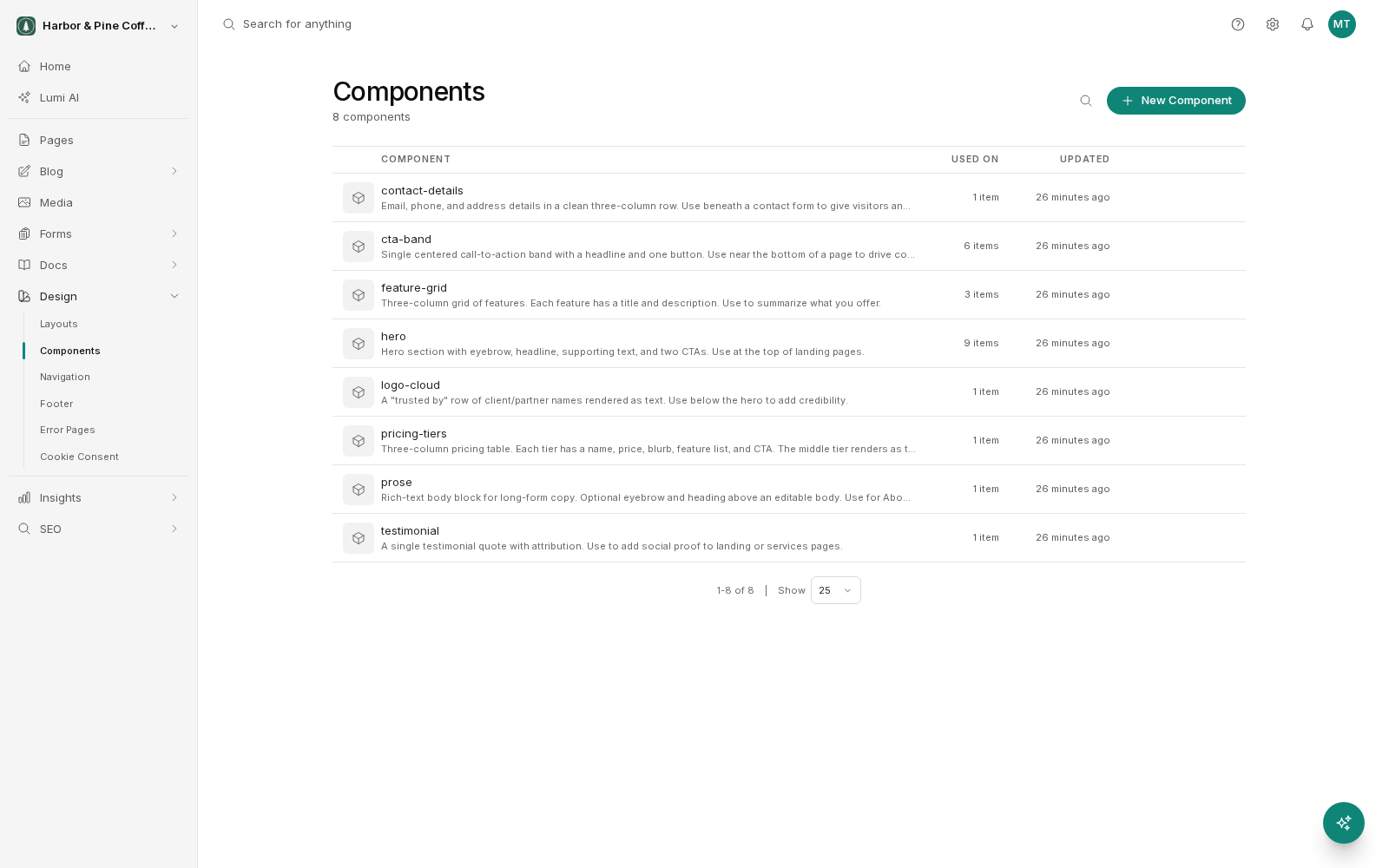
Components live under Design in the sidebar.
Understand what a component gives you
Two things make components worth using.
The first is consistency. Every place a component appears, it looks and behaves the same. Your call-to-action strip has the same spacing and the same button style on all twelve pages that use it, because there is only one of it.
The second is that one change reaches everywhere. Change the wording in the component and every page using it shows the new wording. You do not visit twelve pages.
Insert a component into a page
In the visual editor, add the component where you want it on the page. It appears immediately in the preview using its own content and design.
Where you can place it depends on how the page was built. Pages have places designed to hold blocks, and components go in those places. If you cannot drop a component where you want it, the page may need a change to make room for it.
Edit a component's properties on a page
Most components have properties, settings that can differ from one use to the next. A call-to-action component might have a heading, a line of supporting text, a button label and a button destination. A staff profile might have a name, a photo and a job title.
Select the component in the editor and the properties panel shows those settings. Changing them affects only this page. The same component on other pages keeps its own values. This is how you get one design used everywhere with different words in each place.
If a component has no properties, it shows the same content everywhere it is used, and the only way to change it is to edit the component itself.
Edit the component itself
To change the component's design or its shared content, open it from Design > Components in the sidebar and edit it there.
Be deliberate here. Editing the component changes every page that uses it. That is the point of components, but it means a small edit can have a wide reach. Before publishing a component change, check where it is used and look at one or two of those pages.
The usual draft rules apply. Your component edits are saved as a draft and the live site keeps showing the current published version until you publish the component. Components carry their own version history, so you can look back at earlier versions. Restoring an old version puts it live across every page using the component, so it requires publish permission rather than just edit permission.
Decide when to make something a component
A rough rule: if the same block will appear on three or more pages, or if it will appear on two pages and you expect to change it, make it a component.
If a block appears once and will only ever appear once, building it into the page directly is simpler. There is no benefit to a component with a single use, and it adds a place you have to remember to look.
Components are also how an agency hands a site over well. The client edits the words through properties, and the design stays intact because it is defined in one place.