BrightSite records visits to your site and shows them on a dashboard. You do not need to install anything. Tracking is built in.
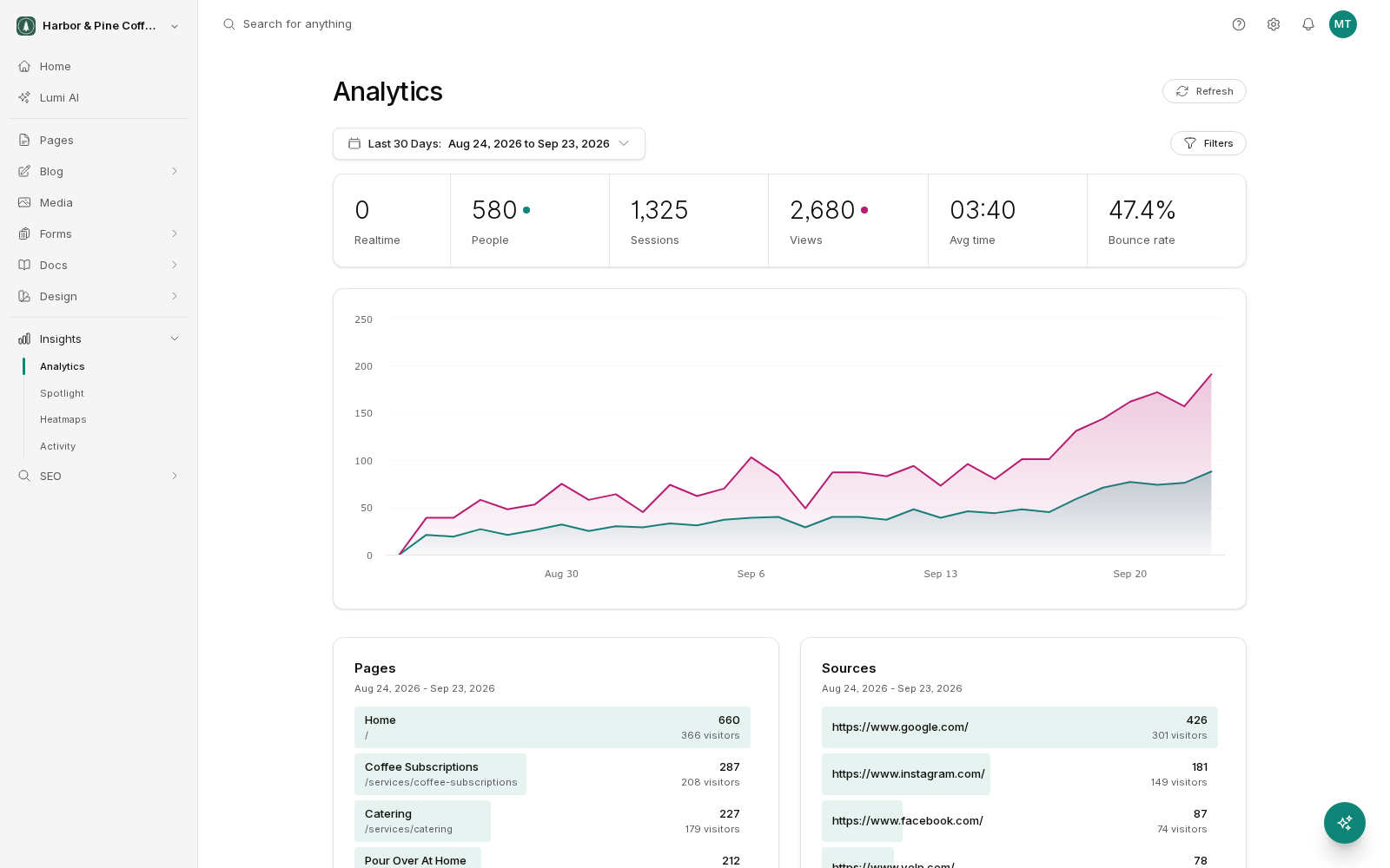
Open Insights in the sidebar, then choose Analytics. The dashboard shows a metric bar, a chart, and a set of panels breaking traffic down by page, source, device, and location.
Choosing a date range
The date range picker sits at the top of the dashboard. Everything on the page (the metric bar, the chart, and every panel) reflects the range you pick.
- Today and Yesterday for a quick check.
- Last 7 Days, Last 30 Days, and Last 90 Days for trends.
- This Month and Last Month for reporting on a calendar month.
- This Year for a long view.
- A custom range when you need specific start and end dates, such as the run of a campaign.
Short ranges move a lot from day to day. If you are checking whether something is working, compare 30 days against the previous 30 rather than reacting to a single day.
What each metric means
The metric bar runs across the top of the dashboard.
- People: how many separate visitors came to your site in the range. Someone who visits three times in a week counts once.
- Sessions: how many visits happened. One person can have several sessions. A session ends after a period of inactivity, so someone returning the next day starts a new one.
- Views: how many pages were loaded in total. One session can include many views.
- Avg time: the average length of a session. Treat it as a rough signal, not a stopwatch.
- Bounce rate: the share of sessions where someone looked at one page and left without going any further.
- Realtime: how many people are on your site right now. Useful straight after you publish something or send an email.
Using the chart
The chart below the metric bar plots your traffic over the selected range. Click a metric in the bar to add it to the chart or remove it. You can show several at once, which makes it easy to see whether a jump in views was driven by more people or by the same people reading more pages.
Filtering the dashboard
Filters narrow the whole dashboard to a slice of your traffic. You can filter by:
- Page: a single page on your site.
- Referrer: where the visit came from.
- Device, browser, and operating system.
- Country, region, and city.
Each active filter appears as a pill above the dashboard. Filters stack, so you can look at mobile visitors from one country who arrived from search. Remove a pill to drop that filter, and the numbers recalculate immediately.
The fastest way to add a filter is to click a row in one of the panels further down the page. Clicking a page name filters to that page; clicking a country filters to that country.
Whose visits are counted
By default, your own visits are counted along with everyone else's. On a small site, editors reloading pages can noticeably inflate the numbers. You can exclude your own IP address so this does not happen. See the analytics settings page in this section.