The visual editor is where you change what is on a page. Open any page from the page list and it loads here. Most of the work you do on your site happens on this one screen.
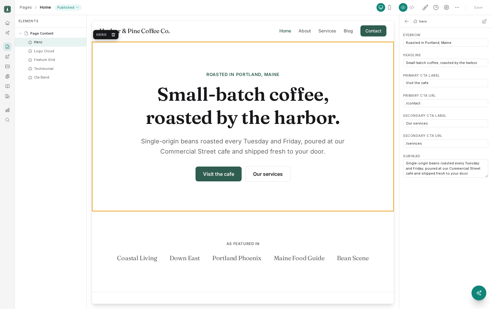
Find your way around
The screen is split into three columns:
- On the left, an element tree listing everything on the page, in order, nested the way it appears, such as headings, paragraphs, images, buttons and sections.
- In the middle, your page as a visitor would see it.
- On the right, a properties panel holding the settings for whichever element you currently have selected.
The tree is useful when an element is hard to click, or when you want to understand how a section is put together. The preview is useful when you want to point at the thing you can see.
Select and edit an element
Click an element in the preview, or click its entry in the tree. Either way it becomes the selected element, and the properties panel fills with what you can change about it, such as its text, its image, its link, and any other settings the element has.
Change a value in the panel and the preview updates so you can see the result. Nothing on your live site has changed at this point; you are working on a private draft.
Not every part of a page is editable. Content is made editable when the page is built, so if you click something and the panel offers you nothing, that element was not set up as editable. Ask whoever built the page, or your agency, to make it editable.
Check the mobile view
There is a toggle for switching the preview between desktop and mobile widths. Use it before you publish anything. Text that fits neatly on a wide screen often wraps awkwardly on a phone, and a large image can push a button below the fold. Most visitors to most small business sites are on a phone, so the mobile view is the one that matters most.
Choose an image
When the selected element has an image, the properties panel gives you a way to change it. This opens the media picker, which shows the files already in your media library and lets you upload a new one.
Pick an existing file where you can. Reusing a file you have already uploaded keeps your library tidy and means the image is already the right size and format. If you upload, upload the largest good-quality version you have. The site handles resizing it for different screens.
Saving and publishing are two different things
This is the most important thing to understand about the editor.
Save sits in the toolbar at the top right. It stays grayed out until you actually change something, then becomes available. Saving stores your work as a draft. It is kept in your account, your teammates can see it, and you can close the browser and pick it up tomorrow. What it does not do is change your public website.
Publishing is the separate, deliberate step that takes the saved draft and makes it the live version. That is the moment your changes become visible to visitors. Publish stays unavailable while you have unsaved changes, so save first.
So the rhythm is to edit, save, check it on desktop and mobile, and publish only when you are happy. There is no risk in leaving work saved but unpublished, because nobody outside your team can see it.
If you make changes and then decide against them, you can revert the page to its published version. Your site keeps a version history too, so a published page can be rolled back to an earlier version. Restoring an old version puts it live immediately, so it counts as publishing rather than editing.